Moving forward from a static and ubiquitous "handicapped" symbol - a blue and white logo of a person leaning back in a wheelchair known as the international symbol of access , which has been under fire from disability activists who feel the logo paints disabled people as passive - the New York City has adopted a new international symbol of access.
The Old Symbol
The old symbol of access was approved by the International Standards Organization (ISO), and the symbol is generally placed wherever access has been improved for people with disability issues. It was first designed by Susanne Koefoed in 1968 - although she didn't give the symbol a head. That was added a while later by Karl Montan.
The Accessible Icon Project
The project has been pushing for an update to the symbol, one that is more modern, and that depicts a more active figure. According to the group, the original design focused too much on the wheelchair, rather than the person who's sitting in it, and depicts that person as stiff and passive.
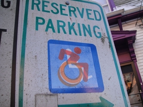
Icon Graphic Elements of New Access Sign
1 - Head Position
4 - Limb Rendition
Indian Initiatives
Sources: The Verge; LaughingSquid; npr; Accessible Icon Project; Enabling Unit;
Read related post: New Handicapped Sign rolls in to New York City
The Old Symbol
 |
| International Sign of Access adopted by ISO is considered as passive by disability activists |
The Accessible Icon Project
The project has been pushing for an update to the symbol, one that is more modern, and that depicts a more active figure. According to the group, the original design focused too much on the wheelchair, rather than the person who's sitting in it, and depicts that person as stiff and passive.
They say this is representative of the treatment that many people with disabilities have faced. "People with disabilities have a long history of being spoken for, of being rendered passive in decisions about their lives," expresses the the group on its website.
"The old icon, while a milestone in ADA (Americans with Disabilities Act) history, displays that passivity: its arms and legs are drawn like mechanical parts, its posture is unnaturally erect, and its entire look is one that make the chair, not the person, important and visible." it says further. It wants to introduce a new design, one that is active and engaged, with a focus on mobility and movement, but still in line with other ISO-approved pictograms.
The new Icon of access
The new design has been created by designer Sara Hendren, who has engaged in a little guerrilla marketing over the years, including illegally stickering over the original design with this new one.
The new design has been created by designer Sara Hendren, who has engaged in a little guerrilla marketing over the years, including illegally stickering over the original design with this new one.
 |
| In the beginning of their project, Sara Hendren & Brian Glenney stuck their new design over existing handicapped signs around Boston in a little guerrilla marketting [photo credits Darcy Hildreth - npr.org] |
Hendren's new design looks more like a person wheeling him or herself independently. Hendren says the real goal of the campaign isn't just to replace the existing symbol with her new design - it's to get people thinking.
There's a much bigger question to ask about who is abled and who is disabled and what we think about dependence and need,'' she said. "I'm just trying to start a discussion where we reevaluate our assumptions and our attitudes.'
The new logo is a more active logo designed by activists at Gordon College in eastern Massachusetts. The NYC will start displaying the logo all over the city starting this summer.
"It's such a forward-moving thing," said Victor Calise, commissioner of the New York mayor's Office for People With Disabilities.
The movement initially started when the group behind the new logo started placing its stickers over old handicapped signs around the Gordon College campus, and eventually stickers of the final design were distributed throughout nearby Boston. While getting the logo around has largely been a "stealth operation" up to this point, visibility from the biggest city in the country should help it gain more traction.
That will make a splash," said Wayne Sailor, co-founder of disabled advocacy groupTASH and professor of special education at the University of Kansas. "I predict it will be a real trendsetter."
 |
| New Sign of Access that more "active" |
Icon Graphic Elements of New Access Sign
1 - Head Position
Head is forward to indicate the forward motion of the person through space. Here the person is the "driver" or decision maker about her mobility.
2 - Arm Angle
Arm is pointing backward to suggest the dynamic mobility of a chair user, regardless of whether or not she uses her arms. Depicting the body in motion represents the symbolically active status of navigating the world.
3 - Wheel Cutouts
By including white angled knockouts the symbol presents the wheel as being in motion. These knockouts also work for creating stencils used in spray paint application of the icon. Having just one version of the logo keeps things more consistent and allows viewers to more clearly understand intended message.
The human depiction in this icon is consistent with other body representations found in the ISO 7001 - DOT Pictograms. Using a different portrayal of the human body would clash with these established and widely used icons and could lead to confusion.
5 - Leg Position
The leg has been moved forward to allow for more space between it and the wheel which allows for better readability and cleaner application of icon as a stencil.
Is this ADA Compliant?
The short answer is yes. Federal and state officials have determined that slight variations on the historical International Symbol of Accessibility are generally permissible as long as the symbol clearly displays a wheelchair and signifies accessibility.
Forward thinking companies such as The TJX Companies, have utilized another progressive symbol by the graphic designer Brendan Murphy. We are grateful that companies like Talbots have embraced the Accessible Icon as well.
Different states have different regulations concerning the size, color, and placement of the symbol. For instance, in Massachusetts, accessible parking spots must be identified by a vertical parking sign, but symbols on the ground are not required. We recommend that you review state and local regulations before painting the Accessible Icon on parking spots or placing the sticker on signs.
Indian Initiatives
 |
| Enabling Unit at UCMS, New Delhi India under the active advocacy of Dr. Satendra Singh have already adopted this logo (photoCredits UCMS) |
Dr. Satendra Singh of University College of Medical Science (University of Delhi & Guru Teg Bahadur Hospital, Delhi, India has not only promoted this sign in his college but also written to the Chief Commissioner Disabilities, Govt. of India to consider revising the current ISA with the new one for India which portrays dynamism and focuses on person rather disability.
He further stressed in his representation that these small steps are highly significant as how Persons with disabilities are represented in society.
Sources: The Verge; LaughingSquid; npr; Accessible Icon Project; Enabling Unit;
Read related post: New Handicapped Sign rolls in to New York City